Every Picture Is a Compromise
Lessons from the Also-rans
Most photography websites show the photographer's very best work. Wonderful. But that's not the full story of a creative life. If we want to learn, we'd better pay attention to the images that aren't "greatest hits" and see what lessons they have to offer. Every picture is a compromise — the sum of its parts, optical, technical, visual, emotional, and even cosmic – well, maybe not cosmic, but sometimes spiritual. Success on all fronts is rare. It's ok to learn from those that are not our best.
This is a series about my also-rans, some of which I've been able to improve at bit (i.e., "best effort"), none of which I would consider my best. With each there are lessons worth sharing, so I will.

Previous image | Next image |
Original digital capture
Choosing Between Variants
So often, the measure of an artist is the sum total of the decisions made along the way to the final production. In essence, choosing between the variants is the core of doing artwork. A or B, color or b/w, vertical or horizontal, X or Y. This week will be an exploration of these choices.
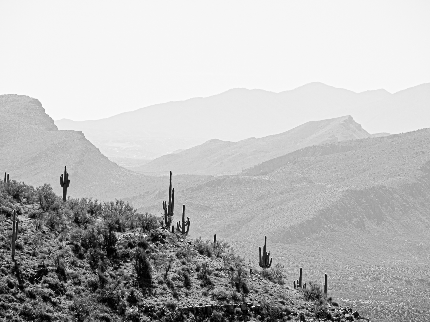
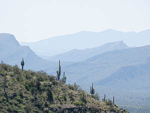
Thoughts on these two variants:
For decades now, the dominant choice in producing a photograph was whether to use color or b/w. Doesn't that seem a bit archaic now? Today, we can choose tint toning, split toning, false color, exaggerated color, mixed b/w and color. The possibilities are endless. Safe to say this variety presents both opportunity and stress.
I used the b/w version at left in a project rather than the color one above specifically because I felt the blue mist was unreal. Dust is not blue. The cactus in the foreground tells us this is in the desert and I felt the blue was not desert-like. In fact, this monochromatic version at left could use a bit of warm toning to make the dust more dust-like. |
|