Every Picture Is a Compromise
Lessons from the Also-rans
Most photography websites show the photographer's very best work. Wonderful. But that's not the full story of a creative life. If we want to learn, we'd better pay attention to the images that aren't "greatest hits" and see what lessons they have to offer. Every picture is a compromise — the sum of its parts, optical, technical, visual, emotional, and even cosmic – well, maybe not cosmic, but sometimes spiritual. Success on all fronts is rare. It's ok to learn from those that are not our best.
This is a series about my also-rans, some of which I've been able to improve at bit (i.e., "best effort"), none of which I would consider my best. With each there are lessons worth sharing, so I will.
Previous image | Next image |
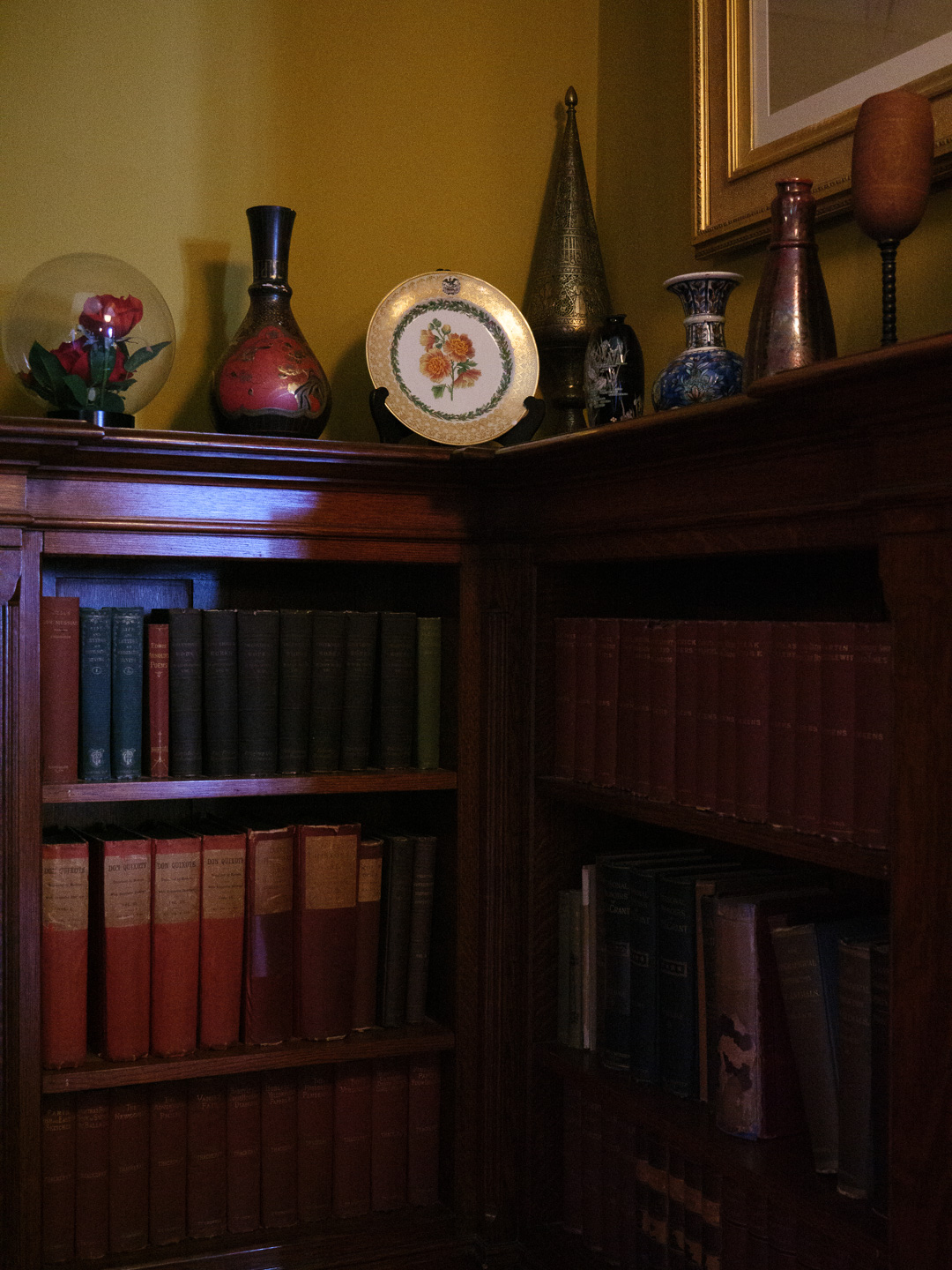
Original digital capture
Gilded Age Week
I've been working on a long-term project photographing in historic Gilded Age homes here in upstate New York. Just getting started, but the project is finding its direction. Here are a few examples. BTW, all handheld at high ISO, then processed with AI Noise Reduction.
What I saw that I liked:
This corner of books is interesting with all the stuff above.
What I don't like in the picture:
In the first shot above, the round plate just feels too low in the composition. Not by a lot, but enough to make the image feel off balance.
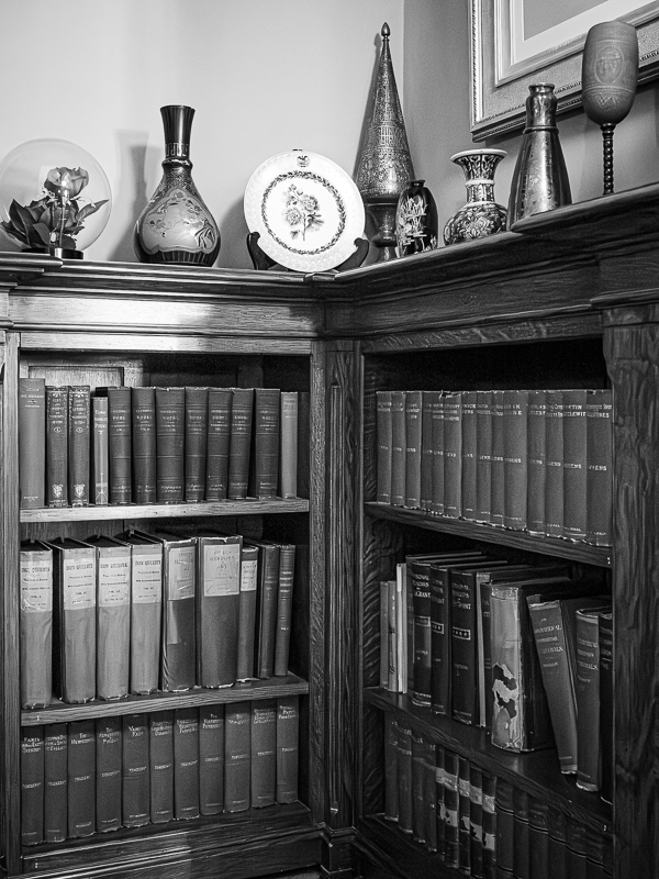
What I learned:
I raised the camera position a tad but made sure the tip of that object in the back wasn't cut off. Again, I converted this one to b/w to eliminate the multiple color balance issue. I'm not sure what I'll do for the final project, but this might be a case where mixed color images with some b/w will work fine. Rare, but possible.
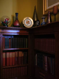
2nd Chances: What I might try next
I think I might be done with this one. I like this composition a lot. |
|