Every Picture Is a Compromise
Lessons from the Also-rans
Most photography websites show the photographer's very best work. Wonderful. But that's not the full story of a creative life. If we want to learn, we'd better pay attention to the images that aren't "greatest hits" and see what lessons they have to offer. Every picture is a compromise — the sum of its parts, optical, technical, visual, emotional, and even cosmic – well, maybe not cosmic, but sometimes spiritual. Success on all fronts is rare. It's ok to learn from those that are not our best.
This is a series about my also-rans, some of which I've been able to improve at bit (i.e., "best effort"), none of which I would consider my best. With each there are lessons worth sharing, so I will.
Previous image | Next image |
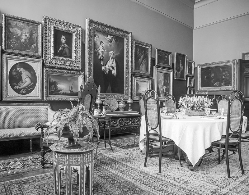
Original digital capture
Gilded Age Week
I've been working on a long-term project photographing in historic Gilded Age homes here in upstate New York. Just getting started, but the project is finding its direction. Here are a few examples. BTW, all handheld at high ISO, then processed with AI Noise Reduction.
What I saw that I liked:
These formal dining rooms are so elaborate. Look at those paintings on the wall!
What I don't like in the picture:
From the angle in the above, that orange light fixture is so bothersome and demanding. I tried cloning it out, but it casts an orange light into that corner that was fighting me.
What I learned:
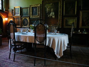
Rather than fight that orange light, I simply changed my angle to eliminate it. The mixed light sources, however, needed four different white balance settings. Rather than fight that battle, I just converted it to b/w and removed the white balance issue entirely. In fact, I prefer this shot in b/w because it makes the picture look like it came from the period.
2nd Chances: What I might try next
Warm-toning? Sepia? |
|


